How to Create & Customize a Secondary Navigation Menu with Dropdown Links on Squarespace
All photographs are original works taken and created by dreamlikediana. All artwork and content are protected by copyright law. Reproduction or distribution without express written permission is strictly prohibited. ©DREAMLIKEDIANA - All Rights Reserved
Before I begin with giving you the code & explaining on how to customize things to your needs, I want to first make sure this is something you’re looking for. So you’re not wasting your time!
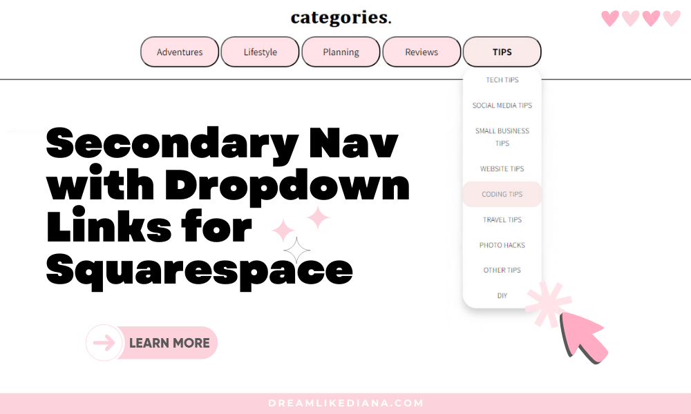
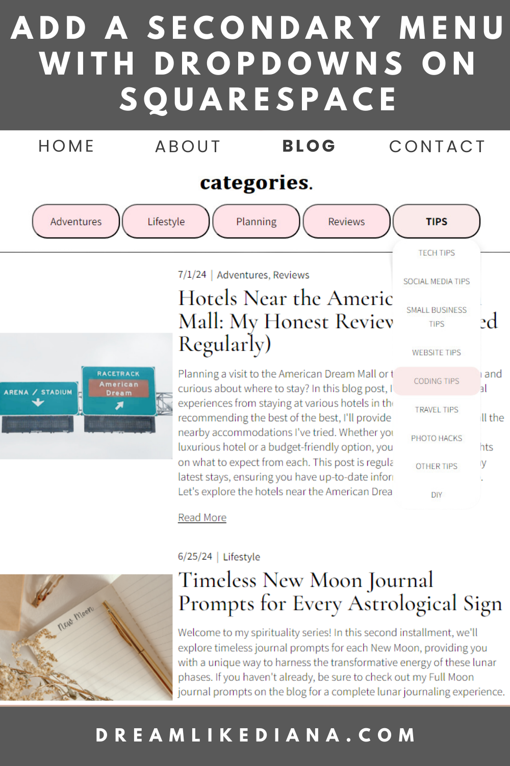
Example A: The main button is a link AND it has a dropdown menu options also have links.
If this is something you’re looking for, great! We can begin!
💖 Psst... I also run a small art shop! If you love cute, useful things like stickers, journals, or creative tools—check out what’s new in my store.

Things to Note:
If you’re looking to use this as your main menu, I’m sorry to disappoint but that is not an option. This is ONLY for a secondary menu or where ever you can utilize code snippets.
You can use this on a personal plan. I’ve utilized code snippets on a personal plan because we’re not using Code Injection at all.
I’m working entirely in Squarespace, if you want to use this elsewhere, that is entirely up to you to figure out!
The font you see on MY site will look different from your site because the code will be pulling the fonts your website is using.
You can also utilize any of these codes without links entirely!
This is free to use, but it would be great if you could support me somehow someway whether it’s backlinking to this post, my blog, or supporting me through monetary means like donation or my shop goodies.
This code works on all screen sizes! It will also work on a tablet and/or a mobile device. For it to dropdown, without the link click on the main button, click on any of the white space around the text.
You Will Need:
Some basic knowledge of HTML & CSS or someone who does. Or at least an open curious mind that doesn’t get frustrated. You’re going to want to enjoy and have fun doing this! It’ll make the process a lot easier if you keep an open mind and give yourself grace.
The hex codes of the colors from your website (and if you don’t know them, take a screenshot of your site & head over to imagecolorpicker.com upload your screenshot to get the codes for your colors).
Open up W3Schools to work on the code so you can see real time fast results
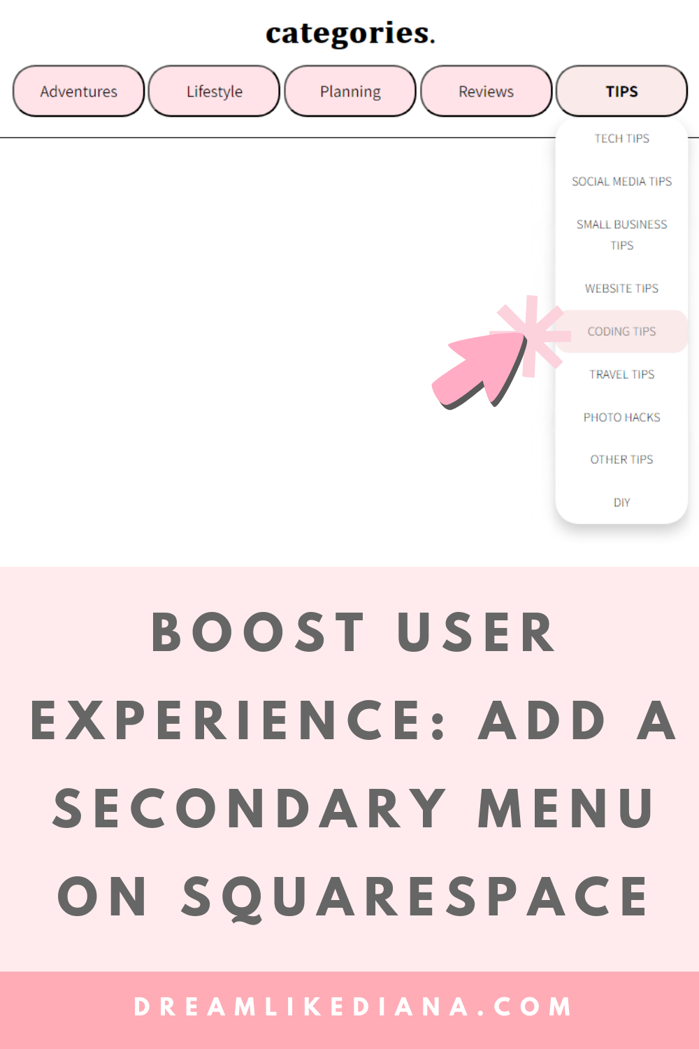
An idea of where you want to post this, ie. sidebar of a blog post, the secondary menu of a blog page or shop categories, etc.
How To:
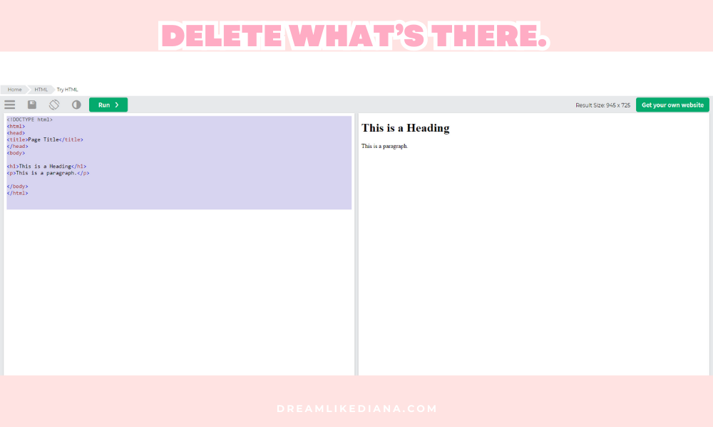
Open W3schools in a new tab.
The code that’s already within W3schools, erase all of it, and then hit RUN.
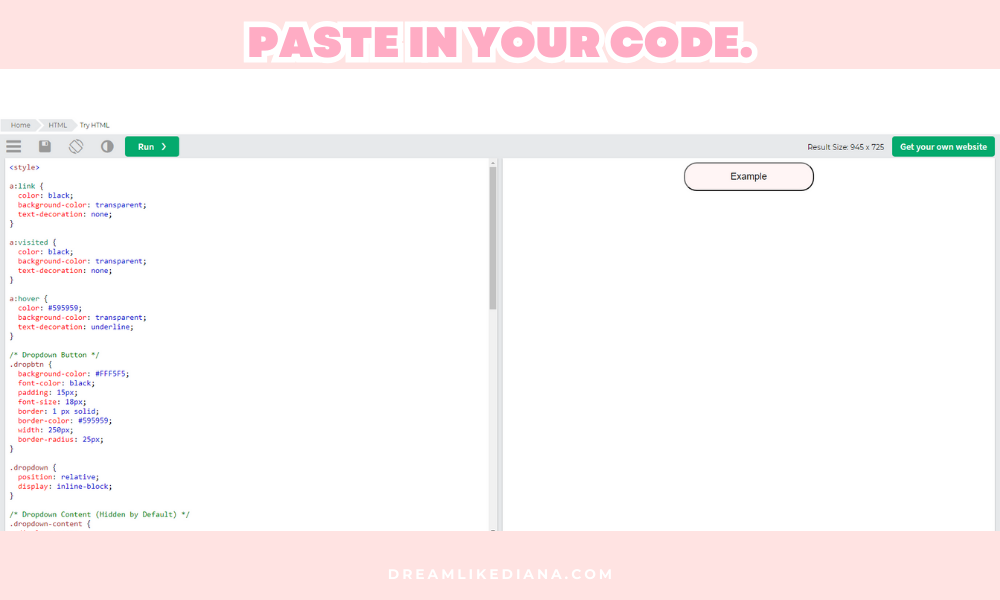
Copy the entire code below & paste it into W3schools. Then click RUN.
With every edit you make to the code, you’re going to want to hit RUN to see the change instantaneously.
Everything you can and cannot change is listed below the code.
NOTE: The code below is stylized to MY website, but it will make explaining things easier on me and you.

The Code:
<style>
/* Dropdown Button */
.dropbtn {
    background-color: #FFF5F5;
    padding: 15px;
    font-size: 18px;
    border: 1px solid #595959;
    width: 250px;
    border-radius: 25px;
}

/* Dropdown Container */
.dropdown {
    position: relative;
    display: inline-block;
}

/* Link Styles */
.dropdown a:link,
.dropdown a:visited {
    color: black;
    background-color: transparent;
    text-decoration: none;
}

.dropdown a:hover {
    font-weight: bold;
}

/* Dropdown Content (Hidden by Default) */
.dropdown-content {
    display: none;
    position: absolute;
    background-color: #faeaea;
    box-shadow: 0px 8px 16px rgba(0, 0, 0, 0.2);
    z-index: 1;
    border-radius: 25px;
    text-align: center;
    width: 250px;
    font-size: 14px;
}

/* Links inside the dropdown */
.dropdown-content a {
    color: black;
    padding: 12px 16px;
    text-decoration: none;
    display: block;
}

/* Show the dropdown menu on hover */
.dropdown:hover .dropdown-content {
    display: block;
}

/* Change button and link styles on hover */
.dropdown:hover .dropbtn {
    background-color: #faeaea;
    color: #595959;
    text-transform: uppercase;
}

.dropdown-content a:hover {
    background-color: #FFF5F5;
    border-radius: 25px;
    text-transform: uppercase;
    font-weight: bold;
}

/* Responsive Width Adjustment */
@media only screen and (max-width: 568px) {
    .dropbtn,
    .dropdown-content {
        width: 300px;
    }
}
</style>

<center>
  <div class="dropdown">
    <button class="dropbtn"><a href="#">Example</a></button>
    <div class="dropdown-content">
      <a href="#">sample 1</a>
      <a href="#">sample 2</a>
      <a href="#">sample 3</a>
    </div>
  </div>
</center>
General Notes:
A basic understanding of HTML and CSS is essential to avoid breaking the code. I am in no way available or accountable if your code breaks or isn’t working. I’m not accountable if you need to start from the beginning. Welcome to the world of coding! You can experience a slither of how difficult things can get. Having basic knowledge in HTML & CSS is a huge plus for this to work as i have created it as. But that being said, like I said in the intro, if you have an open mind and have fun with it, you can make it work! But again, I just don’t have the time on my hands to help anyone. I also can’t be held accountable.
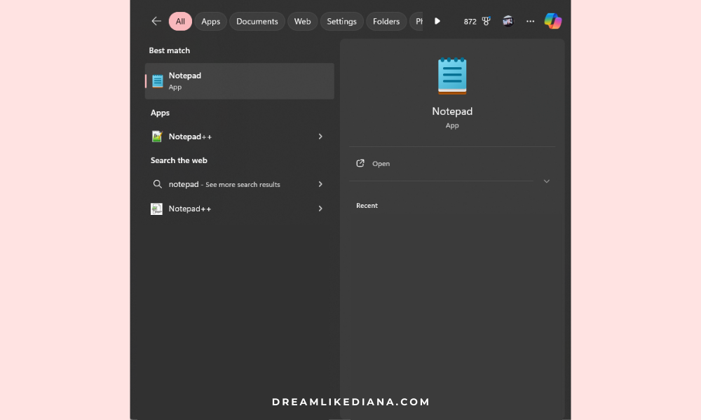
If you want to save and return to your code at a later time or date, you can save on W3Schools, but I personally utilize the Notepad app on PC or or if you’re using an Apple or Mac product check out this web page for a Notepad app alternative for your device. You CANNOT work or save it on word processors like Google Docs or Microsoft Word, to avoid formatting issues. These apps and programs will break the code. If you use Notepad app or similar, save it as a
.txtfile.Allow 2-3 hours, maybe more, for experimenting with the code to achieve your desired result.
Customizable Elements:
Dropdown Button Styles
Find: (.dropbtn) /* Dropdown Button */
background-color: #FFF5F5;can be changed to the main button background color of your choosing. Just make sure you’re using a hex code, it’s a 6 digit number follow by the # sign.color: black;can be changed to your preferred button font color, you can use basic colors like: red, black, blue, etc. or use a hex code.font-size: 18px;can be adjusted to change the size of the button text.border: 1 px solid;can be customized by changing1 pxto a different thickness or removing the border entirely.border-color: #595959;adjust as needed, this dictates the color around your button. You can also remove it entirely or write innone;if you don’t want a border color.width: 250px;can be changed to adjust the button's width.border-radius: 25px;controls the roundness of the button corners. You can experiment with different values or use percentages for a different effect. You can change the number value, but you can also change px to %
Link Styles
See: .dropdown a:
color: black;ina:linkanda:visitedcan be changed to any color you prefer for your link text.color: #595959;ina:hoverNote: The
a:refers to the link styling in HTML.text-decoration: none; Choose to underline or not underline links can be changed to any hover color. Your options are:
  text-decoration: overline;
  text-decoration: line-through;
  text-decoration: underline;
  text-decoration: underline overline;
  text-decoration: none;
Dropdown Content Styles
Find: (.dropdown-content) /* Dropdown Content (Hidden by Default) */
background-color: #FFF5F5;can match the main button's background or be customized to any hex code of your choosing.border-radius: 25px;should typically match the button’sborder-radiusfor consistency, but your choice.text-align: center;can be adjusted toleftorright.width: 250px;should match the button width for a cohesive look.font-size: 14px;can be adjusted to change the dropdown text size.
Links Inside Dropdown
Find: (.dropdown-content a) /* Links inside the dropdown */
color: black;can be changed to match or contrast with the main link color, this is not the background color. This is the link color.
Dropdown Link Hover Styles
Find: /* Change color of dropdown links on hover */
background-color: #faeaea;can be changed to another color.border-radius: 15px;can be adjusted to change the roundness of the dropdown links on hover.font-weight: bold;can be removed or kept based on preference.
Dropdown Button Hover Styles
Find: /* Change the background color of the dropdown button when the dropdown content is shown */
background-color: #faeaea;should ideally match the dropdown link hover background.color: #595959;can be changed to your preferred hover text color.font-weight: bold;can be removed or left as is, play around with it.text-transform: uppercase;can be customized. You can leave it as uppercase or change it to one of the following: none, capitalize, or lowercase.
Mobile/Tablet Screen Styles
Theis code controls the appearance on smaller screens.
@media only screen and (max-width: 568px) {
  .dropbtn {
    width: 300px;
  }
}

@media only screen and (max-width: 568px) {
  .dropdown-content {
    width: 300px;
  }
}
You can change the width: 300px; to adjust the button and dropdown width for mobile devices. With Squarespace, we have the blessing of toggling between desktop and mobile screens quite easily.
HTML Structure
The
<center>tags center the dropdown on the webpage. But make sure</center>is not replaced if you do use it.
Menu Items & Dropdown Options
For each and every button you want you need this code:
<div class="dropdown">
  <button class="dropbtn"><a href="#">Example</a></button>
  <div class="dropdown-content">
    <a href="#">SAMPLE 1</a>
    <a href="#">SAMPLE 2</a>
    <a href="#">SAMPLE 3</a>
  </div>
</div>
So, for example, if you want 4 menu items you need to copy & paste this code 4 times.
<div class="dropdown">
  <button class="dropbtn"><a href="#">Example</a></button>
  <div class="dropdown-content">
    <a href="#">SAMPLE 1</a>
    <a href="#">SAMPLE 2</a>
    <a href="#">SAMPLE 3</a>
  </div>
</div>

<div class="dropdown">
  <button class="dropbtn"><a href="#">Example</a></button>
  <div class="dropdown-content">
    <a href="#">SAMPLE 1</a>
    <a href="#">SAMPLE 2</a>
    <a href="#">SAMPLE 3</a>
  </div>
</div>

<div class="dropdown">
  <button class="dropbtn"><a href="#">Example</a></button>
  <div class="dropdown-content">
    <a href="#">SAMPLE 1</a>
    <a href="#">SAMPLE 2</a>
    <a href="#">SAMPLE 3</a>
  </div>
</div>

<div class="dropdown">
  <button class="dropbtn"><a href="#">Example</a></button>
  <div class="dropdown-content">
    <a href="#">SAMPLE 1</a>
    <a href="#">SAMPLE 2</a>
    <a href="#">SAMPLE 3</a>
  </div>
</div>
Going further, you can decide if the main text button is a link or not. If you want a link you can change the # in <a href="#"> to the link of your choice. The link HAS to be within quotations. So for example, if you want to redirect to a blog page with subcategories as your dropdown menu, the main link would look like:
<button class="dropbtn"><a href="https://www.dreamlikediana.com/blog">Blog</a></button>
Obviously, you need to remove >Example< to whatever you want your main text to be, and in my case I put it as Blog.
Each option you want needs: <a href="#">SAMPLE 1</a> so if you want 7 options in the dropdown, you need 7 of these.
<div class="dropdown">
  <button class="dropbtn"><a href="#">Example</a></button>
  <div class="dropdown-content">
    <a href="#">SAMPLE 1</a>
    <a href="#">SAMPLE 2</a>
    <a href="#">SAMPLE 3</a>
    <a href="#">SAMPLE 4</a>
    <a href="#">SAMPLE 5</a>
    <a href="#">SAMPLE 6</a>
    <a href="#">SAMPLE 7</a>
  </div>
</div>
Again you need to change # to the link of your choice, like we did above, and the text between the ending carrots like >SAMPLE 1< to whatever you want. You don’t have to write it the way I did. I wrote it this way to educational purposes. This is where the text-transform: uppercase; feature comes into play.
Non-Customizable Elements:
.dropdown { position: relative; display: inline-block; }should not be changed as it controls the dropdown's positioning..dropdown:hover .dropdown-content {display: block;}should remain unchanged as it controls the dropdown's visibility on hover.Media queries should be left alone unless you understand responsive design.
“What if I don’t want a dropdown menu?”
If you mean something like this:
Then I got you, but you have to use what I wrote above to figure out the tweaks. Because it is essentially the same thing.
The Code
<center>

<style>
.button {
  background-color: #faeaea;
  color: black;
  padding: 15px;
  font-size: 16px;
  border-radius: 25px;
  border: 1 px solid #000000;
  width: 145px;
  position: relative;
  display: inline-block;
}

.button:hover {
  text-decoration: none;
  text-transform: uppercase;
  font-weight: bold;
  color: black;
}
</style>

<button class="button"><a href="#">EXAMPLE</a></button>

</center>
Inputting Your Finished Code Into Your Squarespace Site
Before you put it on the actual web page you want it on, I would HIGHLY suggest creating a “Not Linked” page. Call it “tester page.”
Make sure it is a blank page.
Turn it off from viewing. No one should be able to find through search results. etc.
Hit save, not publish.
You are then going to go into the “Edit” portion of the page and click the “Add Block” button.
Find where it says </>Code
Click on it.
Where it says,
<p>Hello, World!</p>you’re going to want to erase it.Then paste in YOUR code.
Tweak it around until you get your desired results.
Then you will COPY the code from it, and paste it where you ACTUALLY want it to go.
This way you don’t risk making something public when it’s not exactly how you want it to look. Working on it in W3Schools is one thing, but working on it on your site and making sure everything is working as it’s supposed to is a whole other beast!
Test your finished code on a tester page in the unlinked area on Squarespace.
“What if I don’t own Squarespace, what if I own ______?”
As I mentioned above & in the title, I mainly utilized and created this code for Squarespace. It should work elsewhere. It is entirely up to you to try & figure that out for yourself. I take no responsibility for it. But here’s how I think I would add it to other platforms.
WordPress
Using the Classic Editor: Go to the page or post where you want to add the shop. Switch to the "Text" editor (HTML view) and paste the code where you'd like it to appear.
Using the Block Editor (Gutenberg): Add a "Custom HTML" block to your page or post and paste the code into that block.
Wix
Edit the page where you want to add the Etsy Mini Shop.
Click on the "+" button (Add) and select "Embed" > "Embed a Widget."
Paste the code into the box and click "Update."
Weebly
Open the page editor and drag an "Embed Code" element to where you want the shop to appear.
Click "Edit Custom HTML" and paste the code into the box.
Other Platforms
For other website builders like Webflow, Blogger, or Shopify, the process is similar. Look for an option to add custom HTML or embed code, and then paste your Etsy Mini Shop code in the provided area.
Wrapping It Up
Customizing your website can be both exciting and daunting, especially when working with HTML and CSS. But with a little patience and experimentation, you'll find that the possibilities are endless. Remember, coding is an art—there's no one-size-fits-all approach. Whether you're tweaking colors, adjusting sizes, or adding your personal flair, these changes can make a big difference in how your site looks and feels. Take your time, back up your work, and don’t be afraid to play around with the code. Your website is a reflection of you, so make it something you're proud to show off. Happy coding!
I hope you got what you came here for, and this post helped! If it did, be sure to support me somehow someway. A little goes a long way!
Till next time!
~Diana
Liked this post? You can support me on:
But don’t forget to PIN ME to your Pinterest board before you go!